Scaffoldは、Flutterで作るアプリケーションの中で最も使用されるウィジェット(Widget)の一つです。
Scaffoldなしでは、Flutterは全く使えないといえるでしょう。
本記事では、Scaffoldの各プロパティについて紹介し、どんな時に使用するか解説します。
Flutterの開発を進めるには、FlutterのパッケージをPCにインストールする必要があります。
さらに、VScodeの拡張機能を使えば、時短して開発できます。

- Flutterでアプリを作りたい。
- Scaffoldの使い方を知りたい。
Scaffold
FlutterのScaffoldは、アプリケーションの基本的な構造やレイアウトを提供するウィジェットです。Scaffoldウィジェットは、通常アプリの標準的な画面構造を定義します。
Scaffoldにはいくつか主要な要素があり、管理できるUI部品は、VScodeで確認できます。
コードエディタ上でマウスカーソルを合わせて、「Ctrl」を押しながらクリックしてください。
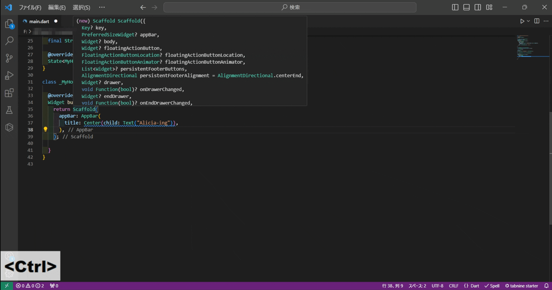
「Scaffold.dart」が開かれて、使用できるプロパティーが表示されます。
class Scaffold extends StatefulWidget {
  /// Creates a visual scaffold for Material Design widgets.
  const Scaffold({
    super.key,
    this.appBar,
    this.body,
    this.floatingActionButton,
    this.floatingActionButtonLocation,
    this.floatingActionButtonAnimator,
    this.persistentFooterButtons,
    this.persistentFooterAlignment = AlignmentDirectional.centerEnd,
    this.drawer,
    this.onDrawerChanged,
    this.endDrawer,
    this.onEndDrawerChanged,
    this.bottomNavigationBar,
    this.bottomSheet,
    this.backgroundColor,
    this.resizeToAvoidBottomInset,
    this.primary = true,
    this.drawerDragStartBehavior = DragStartBehavior.start,
    this.extendBody = false,
    this.extendBodyBehindAppBar = false,
    this.drawerScrimColor,
    this.drawerEdgeDragWidth,
    this.drawerEnableOpenDragGesture = true,
    this.endDrawerEnableOpenDragGesture = true,
    this.restorationId,
  });
}
これらのマテリアルを使用してアプリを作成していきます。
本記事では、アプリケーションバー・画面本体・ボトムバーなどの画面構成部品とボタンやドロワーなどのUI部品に分けて紹介をします。
key
keyは、公式ページが述べているように、
同じ型のウィジェットが複数ある場合、区別するために使用するものです。
扱いが難しいので、複雑なアプリケーションを作らない場合は、無視しても大丈夫です。
A Key is an identifier for Widgets, Elements and SemanticsNodes.
A new widget will only be used to update an existing element if its key is the same as the key of the current widget associated with the element.
Key class – foundation library – Dart API
appBar
appBarは、スクリーンの上部に表示するアプリケーションバーを定義するプロパティです。
スクロールできるアプリバーを作成する場合は、 SliverAppBarを使用します。
App bars are typically used in the Scaffold.appBar property, which places the app bar as a fixed-height widget at the top of the screen. For a scrollable app bar, see SliverAppBar, which embeds an AppBar in a sliver for use in a CustomScrollView.
AppBar class – material library – Dart API
body
アプリケーションバー(appBar)とボトムバー(bottomNavigationBar)の間に配置される要素ー要するに、アプリの本体となり情報の提供や操作をする場所になります。
The widget in the body of the scaffold is positioned at the top-left of the available space between the app bar and the bottom of the scaffold. To center this widget instead, consider putting it in a Center widget and having that be the body. To expand this widget instead, consider putting it in a SizedBox.expand.
body property – Scaffold class – material library – Dart API
floatingActionButton
画面上に円形のボタンとして配置されます。
1画面に1つだけ使用されて、作成や共有、ナビゲーションなどのアプリケーションの主要な動作を促進します。
A floating action button is a circular icon button that hovers over content to promote a primary action in the application. Floating action buttons are mo0st commonly used in the Scaffold.floatingActionButton field.
Use at most a single floating action button per screen. Floating action buttons should be used for positive actions such as “create”, “share”, or “navigate”. (If more than one floating action button is used within a Route, then make sure that each button has a unique heroTag, otherwise an exception will be thrown.)
FloatingActionButton class – material library – Dart API
floatingActionButtonを使用すると、画面の右下にボタンが配置されます。このボタンを中央に配置、ボトムバーと重ねるには、「floatingActionButtonLocation」を使用します。
floatingActionButtonAnimatorは、ボタンにアニメーションを制御するプロパティです。
persistentFooterButtons
bodyプロパティの下に複数のボタンを配置できます。
また、bodyをスクロールしても、これらのボタンは、画面上に保持されます。
A set of buttons that are displayed at the bottom of the scaffold.
Typically this is a list of TextButton widgets. These buttons are persistently visible, even if the body of the scaffold scrolls.
These widgets will be wrapped in an OverflowBar.
The persistentFooterButtons are rendered above the bottomNavigationBar but below the body.
persistentFooterButtons property – Scaffold class
drawer
アイコンボタン(ハンバーガーメニュー)を配置して、ボタンを押すと水平にスライドして、ナビゲーションリンクを表示します。
A Material Design panel that slides in horizontally from the edge of a Scaffold to show navigation links in an application.
There is a Material 3 version of this component, NavigationDrawer, that’s preferred for applications that are configured for Material 3 (see ThemeData.useMaterial3).
Drawer class – material library – Dart API
drawerは、画面左にアイコンが配置されます。
一方でendDrawerは、画面右にアイコンが配置されます。
bottomNavigationBar
画面の下部(ボトム)にナビゲーションバーを配置します。
アイコンやテキストを表示し、3つ~5つの項目を表示します。
A material widget that’s displayed at the bottom of an app for selecting among a small number of views, typically between three and five.
There is an updated version of this component, NavigationBar, that’s preferred for new applications and applications that are configured for Material 3 (see ThemeData.useMaterial3).
The bottom navigation bar consists of multiple items in the form of text labels, icons, or both, laid out on top of a piece of material. It provides quick navigation between the top-level views of an app. For larger screens, side navigation may be a better fit.
BottomNavigationBar class – material library – Dart API
bottomSheet
ユーザーは、ボトムシートを直接的に使うことはなく、ボタンを押すと、下部からテキストを添えたシートが表示されるものです。
The BottomSheet widget itself is rarely used directly. Instead, prefer to create a persistent bottom sheet with ScaffoldState.showBottomSheet or Scaffold.bottomSheet, and a modal bottom sheet with showModalBottomSheet.
BottomSheet class – material library – Dart API
backgroundColor
ウィジェットのマテリアルに色を付けます。
The color of the Material widget that underlies the entire Scaffold.
The theme’s ThemeData.scaffoldBackgroundColor by default.
backgroundColor property – Scaffold class – material library
現在は、primaryやonprimaryは非推奨となり、代替としてbackgroundColorとなりました。
this.primary = true,extendBody
bodyの範囲ボトムナビゲーションバーまで拡張するプロパティです。
同様に、extendBodyBehindAppBarはアプリケーションバーまで拡張するプロパティです。
通常では重ねませんが、trueにすることで変更できます。
If true, and bottomNavigationBar or persistentFooterButtons is specified, then the body extends to the bottom of the Scaffold, instead of only extending to the top of the bottomNavigationBar or the persistentFooterButtons.
extendBody property – Scaffold class – material library
restorationId
Flutterフレームワークにおいて、ウィジェットの状態を保存し、ページで構成されたルートの状態を保存および復元するための復元ID。
復元IDが指定されていない場合、ルートはその状態を復元されません。
Restoration ID to save and restore the state of the Route configured by this page.
If no restoration ID is provided, the Route will not restore its state.
restorationId property – Page class – widgets library – Dart API
UdemyでFlutterを学習
Udemyは、オンデマンド式の学習講座です。
趣味から実務まで使えるおすすめの講座を紹介します。
- Flutterアプリ開発講座(初級編)
Flutterアプリ開発の初歩から学習できて、
Flutter未経験・プログラミング初心者におすすめ
- 【Flutter】UI開発でよく使うWidget50選
Flutterで頻出Widgetを紹介している。
始めたばかりで機能を覚えたい人におすすめ
- The Complete Flutter Development Bootcamp with Dart
GoogleとFlutterチームが共同作成した講座。
本格的なFlutterエンジニアになりたい人におすすめ
まとめ
Scaffoldは、アプリケーションの基本的な構造やレイアウトを提供するウィジェットで、Flutterでのアプリ開発では必要不可欠な要素です。
主に、プロパティはアプリケーションバー、画面本体、ボトムバーから構成されています。
加えて、ボタンやドロワーなどのUI部品をウィジェットがあります。
これらを使ってFlutterでは、アプリケーション開発のハードルが低いです。